
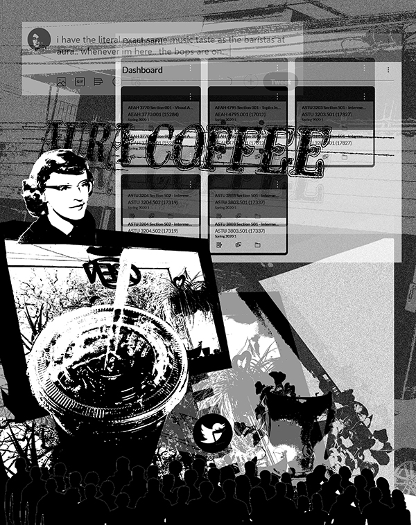
 First looking at the piece, you can make clear distinctions in the tone. The composition
is in black and white, recognizable words and symbols are present, and the composition
can be considered busy. As I've attended The University of North Texas, my favorite
coffee shop to go to study has been Aura Coffee off of Hickory St. and Fry, right
next to the Language Building and CVAD. Its importance to me and my student activities
is reflected on here, as it is the main focus of the piece and where I have gathered
all of my images. When I think of a space to study, I instantly think of an independent
coffee shop. The DIY labeling, the house plants, and the indie music playing subtly
in the background.
First looking at the piece, you can make clear distinctions in the tone. The composition
is in black and white, recognizable words and symbols are present, and the composition
can be considered busy. As I've attended The University of North Texas, my favorite
coffee shop to go to study has been Aura Coffee off of Hickory St. and Fry, right
next to the Language Building and CVAD. Its importance to me and my student activities
is reflected on here, as it is the main focus of the piece and where I have gathered
all of my images. When I think of a space to study, I instantly think of an independent
coffee shop. The DIY labeling, the house plants, and the indie music playing subtly
in the background.
To me, I have to be in a setting where I am surrounded by things constantly going on, and I reflect that in my piece by adding both a lot of things going on in the composition, but also a more literal element by adding the silhouettes of people at the bottom of the composition. As I am studying, I have my laptop opened to multiple apps at a time, including Youtube open to playing either smooth jazz music, or one of my recent favorites, Connie Converse. Her presence in my studying routine is reflected in her portrait being portrayed in the composition as well. Along with my music, I, of course, have the Canvas website open to see my grades as well as my assignments that I am working on, as I access most of my readings through Canvas. I put a screenshot of my Canvas dashboard at the bottom layer of my composition. Lastly, as I'm working on anything, I have to be actively distracting myself. This sounds counterproductive, but, if I don't give my brain a break from what I'm working on, it is easy for me to overwork myself. That is why I actively have Twitter open to have a few quick laughs as I'm working. This is reflected in my composition with both a tweet I posted while working on this at Aura, and the Twitter logo put into the layers of the composition.
This composition was achieved through using the layers feature, the Grayscale feature, and the Threshold feature, all present in Photoshop. I first started out with photos gathered at Aura Coffee and outside of it, as well as screenshots of pages that I actively visit while I am studying. Then, I opened up my document and converted the colors to “grayscale” by going to “Image>Mode>Grayscale”. Then, as I opened up images, I cropped them and messed with their size to place them correctly in my composition. After doing this, I would go to “Image>Adjustment>Threshold…” and play with the slider to get the grainy effect as if they were printed with xerox or a printing press. This style added to simplifying the colors so that all the images were coherent, but to also add focus to a chaotic composition. I also think it accurately reflects the indie/DIY nature of independent coffee shops that I love visiting as I am studying. Lastly, as I tweak my composition, I would play with the opacity of the layers and layer the composition to see how the layering would affect the composition and to see what the graininess would do together.
Overall, I am quite happy with the results of the composition, as it accurately reflects both my studying process and studying location both through literal images, as well as, the overall tone that the image creates.